CaTI consists of different applications. Starting with the dashboard, you have access to calculations, collaborations (of calculations), analyzer and network DEA. Below you will find more details for each area.
Overview:
1. Dashboard
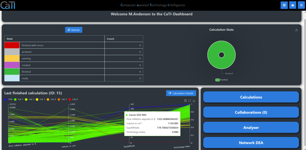
After logging into CaTI, you will find our dashboard, where you can see
- summation list of all calculations sorted by status and total amounts by each, you have access to
- detail draft of the last finished calculation
- Link to all calculations
2. Calculations
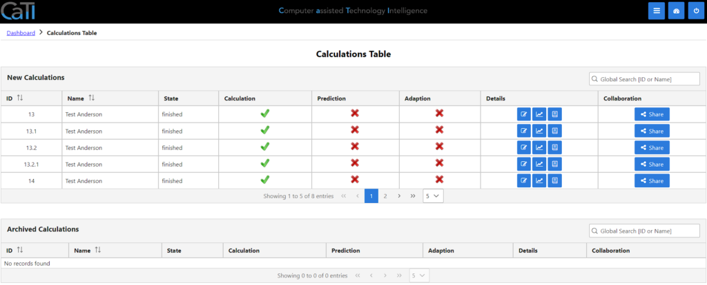
2.1 Calculation Overview
In the calculations page, you can see all the calculations you have access to. The first area is showing all new calculations, that are not archived. The second area shows all archived calculations. Calculations that are derived from a previous one can be seen as child-numbers (like 13.1 for the first revision of 13, 13.2 for the second revision of 13, or 13.2.1 for the first revision of the second revision of 13).
You can dive into the details, looking at the calculation details, calculation charts or the calculation protocol.
Also, you can use the collaboration features, CaTI is providing.
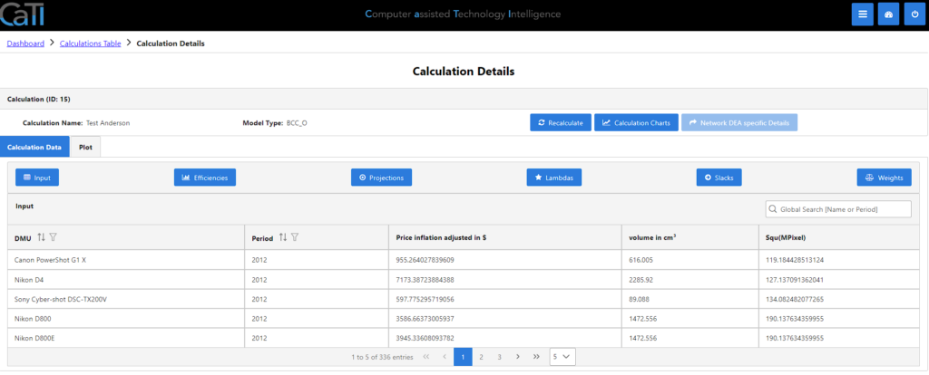
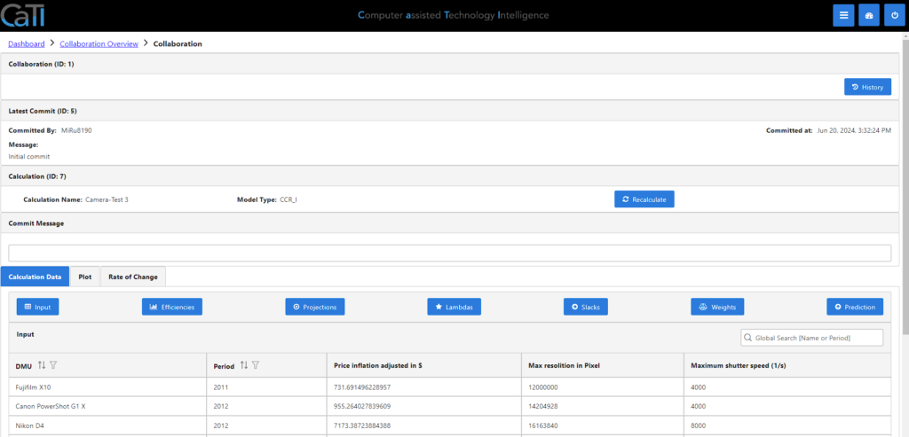
2.2 Calculation details
In the calculation details, you can see your calculations that are already processed. Here you have different options to proceed.
You have the option to recalculate all the data, after you adjusted some of the configurations. Also, you can switch to the calculation charts or the calculation protocol. For calculations using a network DEA model, an additional button allows to open details specific to network DEA.
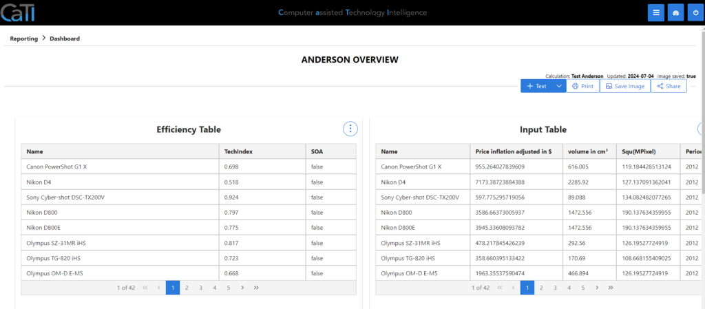
In the first tab “Calculation Data” you can view the results of the calculation for all analyzed products (called DMUs here due to the DEA methodology) in several tables:
- Input: shows the values of the DMU properties used as input data for the calculation.
- Efficiencies: shows for each DMU the efficiency and whether it belongs to the state of the art (SOA), i.e. whether it is efficient.
- Projections: shows the projection of each DMU onto the state-of-the-art frontier. This means the numbers here show the DMU properties if the DMU was efficient without changing its weights of the properties.
- Lambdas: shows the weighted contributions of SOA DMUs to obtain the projection of each SOA onto the frontier.
- Slacks: shows the deviations between projected properties on the frontier and current properties for each DMU.
- Weights: shows how the properties of each DMU are weighted to calculate its efficiency since the DEA method allows each DMU to have individual weights (see DEA methodology for more details).
- Prediction: shows the predicted properties for each former SOA according to the TFDEA methodology if the calculation was performed including the prediction step.
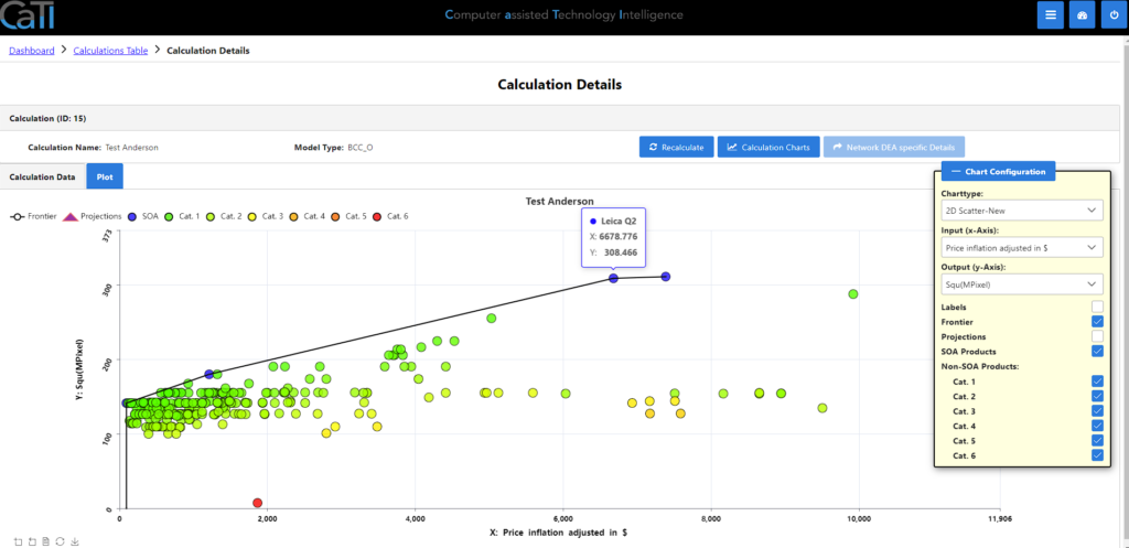
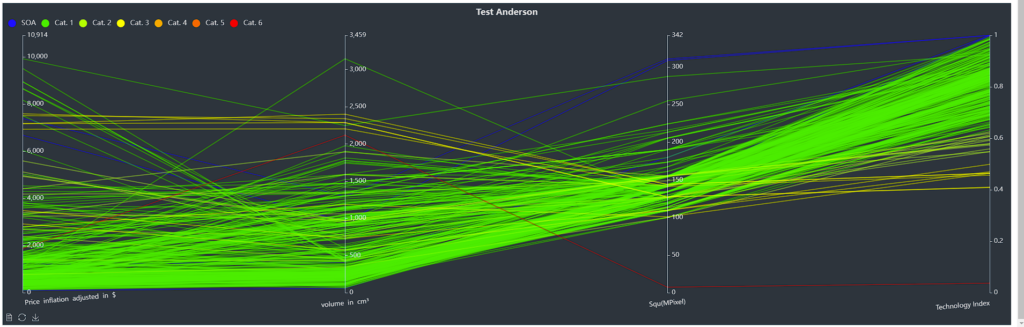
Also, you can make a plot of all calculated data in the second tab. You can choose between different chart types and, in case of coordinate system, you can select one input for x-Axis and one output for y-Axis. Next, you have different options to show or hide:
- Labels: shows the names of each DMU.
- Frontier: shows the calculated frontier line.
- Projections: shows the projections of the DMUs onto the frontier.
- SOA Products: shows the properties of the efficient / state-of-the-art (SOA) DMUs
- Non-SOA Products for Cat. 1 – Cat. 6: shows the properties of some inefficient / non-SOA DMUs. All non-SOA DMUs are split into 6 categories based on their efficiencies with Cat. 1 having the highest efficiency values.
In this plot, you can hover above each DMU, seeing more details.
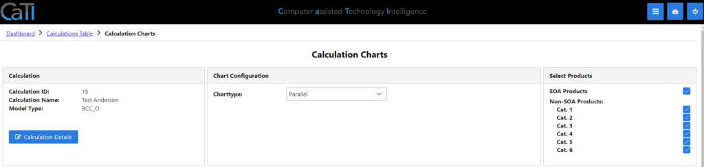
2.3 Calculation charts
In the calculation chart, you can see the data in a different form. Like in the calculation details, you can see all the plotted data here and switch between the plotting-details.
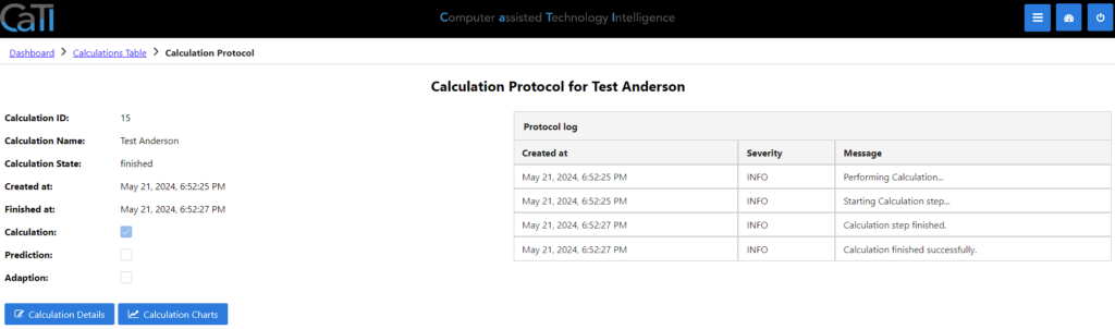
2.4 Calculation protocol
The calculation protocol shows you protocol and background information about what was done with different time-stamps.
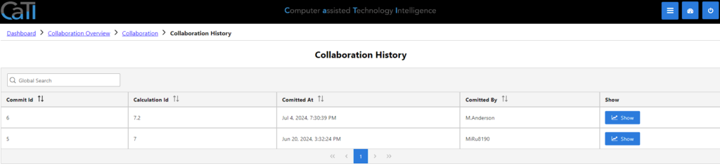
3. Collaborations
In the collaboration overview you can see all the calculations, that are shared with you, including a protocol log.
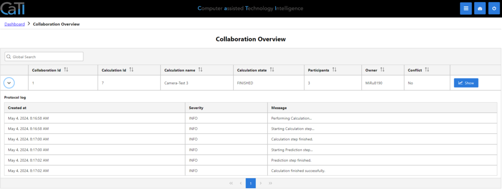
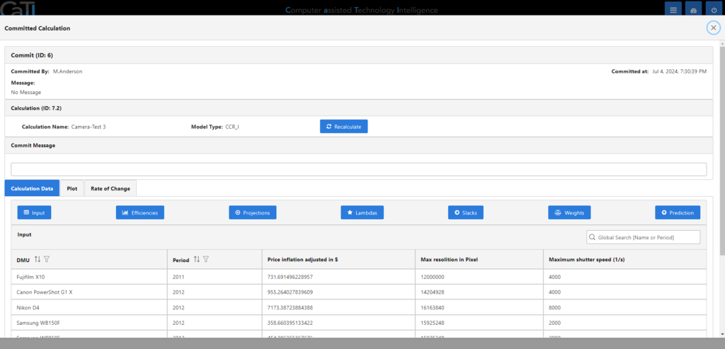
Clicking on the show-button, you can view the details of the shared calculation. Like in the own calculation details (see here), you can make a recalculation, after changing some data. You have the same tabs like before: Calculation data to see the details of the calculation, plot to get a graphical overview and the rate of change in case you used the prediction.
Going into the History with the button on the right top, you can get an overview about all the changes and commit messages made.
Here, you can see all the details for the committed changes in the collaborations.
4. Analyzer
In the analyzer, you have the option to create individual reporting dashboards.
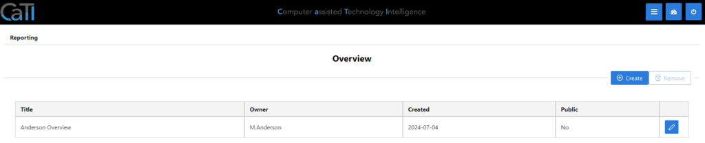
In the details of a report, you can rearange the calculated information as needed to create an individual appearance of the data, with the option to print or save as an image.
5. Network DEA
TODO – definition needed
6. References
[1] Komi Lolonyo Adjogble. „Technology Intelligence durch DataEnvelopment Analysis, neuronale Netzwerke und System Dynamics Methoden.“ German. PhD thesis. FernUniversität Hagen, Mar. 21, 2022